16 Best World Cup 2026 Jerseys, Ranked
World Cup jerseys have become part football uniform, part national identity and part fashion.
And in 2026, many of the most interesting designs don't simply place a federation badge on a familiar color. They use architecture, textiles, national symbols, older shirts and cultural references to create something people may still want to wear years after the tournament ends.
We've ranked 16 of the designs that stand out most to us for the 2026 World Cup.
Best World Cup 2026 jerseys at a glance
| Rank | Team | Kit | Brand | Standout feature |
|---|---|---|---|---|
| 1 | Mexico | Away | adidas | White tonal cultural pattern |
| 2 | Japan | Away | adidas | Multicolor vertical lines |
| 3 | France | Home | Nike | Layered blue graphic |
| 4 | Germany | Home | adidas | Retro black-red-gold geometry |
| 5 | United States | Home | Nike | Moving red-and-white stripes |
| 6 | Morocco | Away | PUMA | Subtle geometric pattern |
| 7 | Uruguay | Away | Nike | Dark blue armored look |
| 8 | Argentina | Home | adidas | Modern sky-blue stripes |
| 9 | Spain | Away | adidas | Ivory literary-inspired look |
| 10 | Colombia | Home | adidas | Yellow tonal graphics |
| 11 | Belgium | Away | adidas | Pastel surrealist graphics |
| 12 | Scotland | Away | adidas | Coral retro pinstripes |
| 13 | Ghana | Home | PUMA | Black Star graphic |
| 14 | South Africa | Away | adidas | Deep green and gold palette |
| 15 | DR Congo | Home | Umbro | Leopard-inspired pattern |
| 16 | Curaçao | Away | adidas | Caribbean color accents |
Our World Cup 2026 jersey ranking
Mexico away — adidas

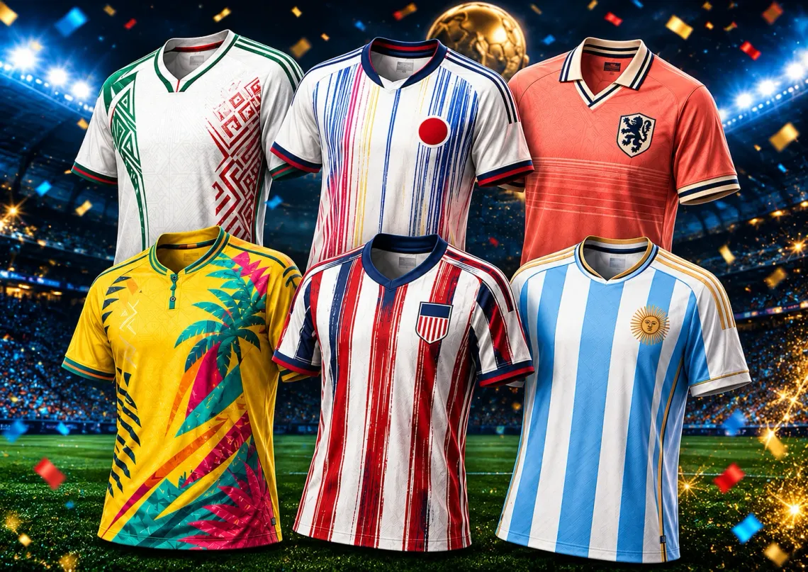
Mexico's away shirt proves that a national-team jersey doesn't have to use the country's most obvious color to feel instantly recognizable.
The mostly white design is covered in a subtle geometric texture, while green and red accents reconnect it immediately to Mexico.
Japan away — adidas

Japan takes a simple light-colored jersey and transforms it with thin vertical lines in multiple colors.
The result is playful without feeling chaotic. From a distance it still looks clean; close up, the colored lines become the whole story.
France home — Nike

France doesn't abandon its traditional blue, but it gives the familiar color much more movement.
Different blue tones and fine diagonal graphics create depth across the shirt, while the lighter collar prevents the design from becoming too dark.
Germany home — adidas

Germany's home shirt looks familiar for exactly the right reason.
The white base and angular black, red and gold shapes recall some of the country's most memorable older adidas kits without simply reproducing one.
United States home — Nike

For a host nation, subtle probably wasn't the goal.
The U.S. shirt stretches the familiar red-and-white stripe idea into a flowing pattern that looks like a flag caught in motion.
It should also read extremely well on television — something that matters when the tournament is happening on home soil.
Morocco away — PUMA

Morocco's away design is one of the quietest shirts here, and that's part of its appeal.
A light neutral base carries a subtle repeating geometric pattern, while the red and green neckline provides the unmistakable national reference.
Uruguay away — Nike

Uruguay moves far away from the traditional Celeste with a dramatic black-and-electric-blue alternate shirt.
The sharp graphics give the jersey an almost armored appearance, making it one of the tournament's most aggressive visual designs.
Argentina home — adidas

Argentina doesn't need to reinvent much to produce an instantly recognizable World Cup shirt.
The 2026 home jersey keeps the white and sky-blue vertical identity, but the blue sections use tonal variation that gives the classic look more depth.
Gold details naturally carry extra weight for the defending world champions.
Spain away — adidas

Spain has one of the most wearable away designs in the tournament.
The ivory base, burgundy details and subtle surface graphics make it feel less like a conventional match shirt and more like something designed to work beyond the stadium.
Colombia home — adidas

Colombia wisely keeps the yellow that makes its national team instantly recognizable.
The difference is in the surface: tonal graphics give the shirt texture without interfering with the strong yellow-blue-red identity.
Belgium away — adidas

Belgium is one of the teams taking the biggest aesthetic risk.
Soft blue and pink sit underneath abstract graphics that feel much closer to contemporary art than to a traditional national-team shirt.
It won't be everyone's favorite, which may be exactly why it deserves a place in this ranking.
Scotland away — adidas

Scotland's away shirt succeeds because it doesn't try to resemble the home kit.
The coral color and narrow dark vertical lines create a strong retro mood while remaining unmistakably different from what people normally associate with Scotland.
Ghana home — PUMA

Ghana's Black Star doesn't sit quietly on this jersey — it becomes the visual anchor.
Fine red, green and gold graphics spread around the white shirt and give the design considerably more energy than a plain national-team home kit.
South Africa away — adidas

South Africa's dark green and gold combination has an immediately classic feel.
The tonal vertical pattern keeps the body from looking flat, while the white collar adds the kind of retro detail that has become increasingly popular in modern football kits.
DR Congo home — Umbro

DR Congo uses its Leopards identity literally enough to be recognizable without covering the shirt in a conventional animal print.
White flowing graphics rise across the bright blue base, giving the design movement and a clear identity of its own.
Curaçao away — adidas

Curaçao closes the ranking with one of the most cheerful palettes in the group.
The pale-yellow base is paired with dark blue trim and small bursts of red, pink, orange and green, giving the shirt a distinctly Caribbean personality.
Our World Cup 2026 jersey podium
A cultural design that stays clean and extremely wearable.
The most clever use of color among the shirts in this ranking.
A traditional national color given considerably more movement and depth.
Why World Cup 2026 jerseys feel more personal
The strongest shirts in this group have one thing in common: they don't feel like the same template with a different badge.
Mexico uses a tonal cultural motif. Japan builds its identity around thin colored lines. Germany looks back toward its own football history, while Morocco, Ghana and DR Congo incorporate graphic ideas connected to national visual identity.
Even when the basic color remains traditional, the detail work helps make the jersey specific to the team.
Which World Cup 2026 jersey would we actually wear?
Mexico's away shirt would be our easiest everyday choice. The white base makes it wearable while the tonal pattern gives it enough character to avoid looking generic.
Japan is probably the most collectible of the group, while Spain's ivory away shirt is another strong option if you prefer something understated.
If what you want is a jersey that immediately screams World Cup, the United States home shirt and Argentina's iconic stripes are harder to miss.
Frequently asked questions
What is the best World Cup 2026 jersey?
In our editorial ranking, Mexico's 2026 away jersey takes first place, followed by Japan's away kit and France's home shirt. The ranking is subjective and considers visual design, national identity, originality and wearability.
Which World Cup 2026 jersey has the most unusual design?
Japan's away shirt is one of the most distinctive designs thanks to its light base and multiple thin colored vertical lines. Belgium's pastel away jersey is another of the tournament's more unconventional looks.
Which World Cup 2026 jersey has the strongest retro style?
Germany's home shirt is one of the clearest retro-inspired designs, using angular black, red and gold graphics over a traditional white base. Scotland and South Africa also use details that give their shirts a strong vintage feel.